Editorial pairing
We take on very few matters.
Nine partners. One office. Work that rarely gets talked about.
Make an enquiryThe same page, set three different ways: editorial serif, modern sans and classic caps. This is the decision that matters most on a website and the one that usually gets made last.
Right forEveryone. Press the button, tell us which of the three sounds like your business, and the rest of the site follows from it.
Kinetic headline
Booked by name
Book nowLetters rise and settle one after another. Reserve it for the single biggest line on the site. It draws the eye exactly once, and stops working the moment you repeat it.
Right forOne headline, on the home page. Launches, venues, anything with a sense of occasion.
Gold foil
Meridian
Register interestA gold gradient with a highlight travelling across it, so the wordmark reads as pressed foil rather than yellow text. Costs nothing and looks like a print finish.
Right forAnything sold on material quality. Jewellers, spirits, developments, private clubs, tailoring.
Outline to fill
Hollow letters that fill with color on hover. Makes a large navigation read like a poster. Best with three to five items, never with a full menu.
Right forSites with few pages and a lot of confidence. Clinics, restaurants, studios, hotels.
Line mask
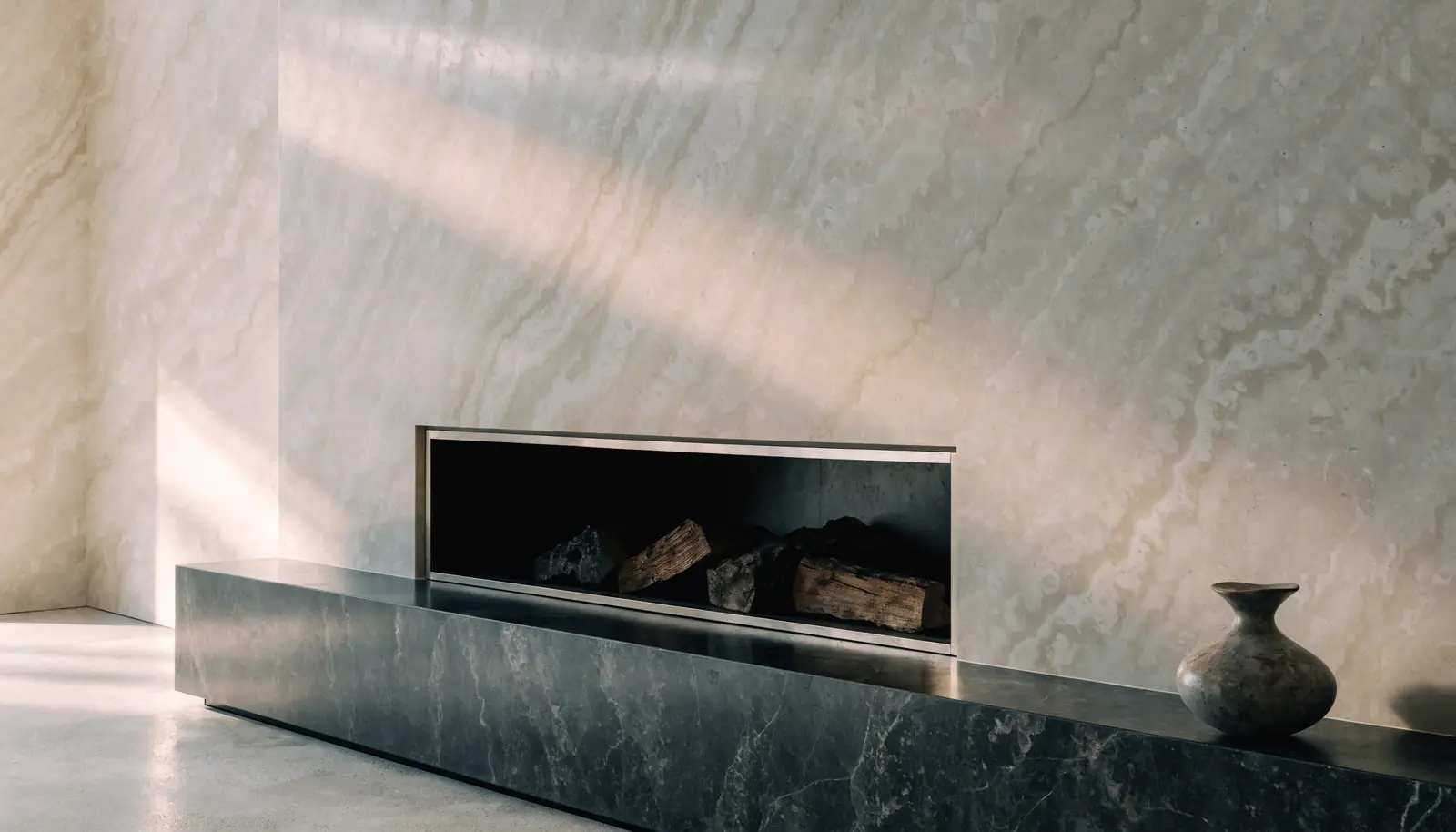
We make roomsthat hold their nerve.
Nine projects since 2009. We would rather show you three of them properly.
Open the archiveEach line slides up from behind a hidden edge, like type being set by hand. The quietest premium reveal on this page, and the easiest to overuse.
Right forAnywhere restraint is the message. Architecture, law, finance, art, medicine.
Emphasis
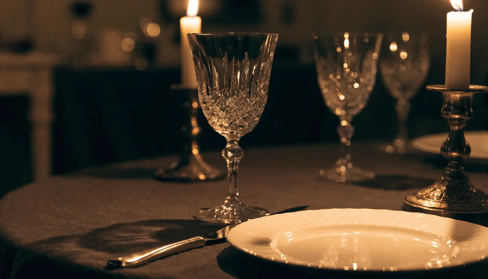
Twenty seats, and one seating a night.
A menu that changes when the market does, and a room that never turns over twice.
Book a tableThree ways to lean on one phrase: gold italic, gold roman, or a drawn underline. Pick one and use it everywhere. Mixing all three is the fastest way to look amateur.
Right forEvery site. It is the smallest decision on this page and the one clients notice most.
Photograph inside type
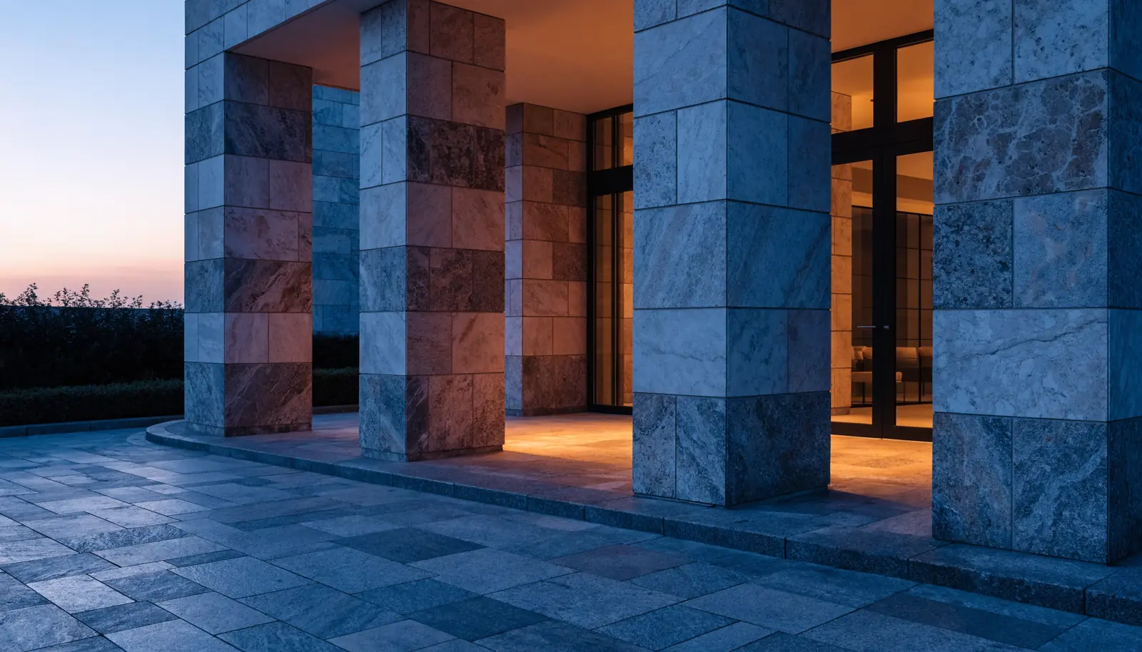
Vessel
Start a projectYour photography fills the letterforms and drifts slowly inside them. Needs a short name and a heavy weight, because thin type shows too little of the picture to read as one.
Right forNames of one or two words. Studios, developments, fashion, spirits, festivals.
Ticker
Booked by name,
not by algorithm.
Book nowA slow band of type crossing the page under the hero. Fills the awkward gap between two sections and gives a still page a pulse. One per site, never two.
Right forAnywhere you have a list of services worth repeating. Salons, garages, agencies, retail, trades.
Weight wave
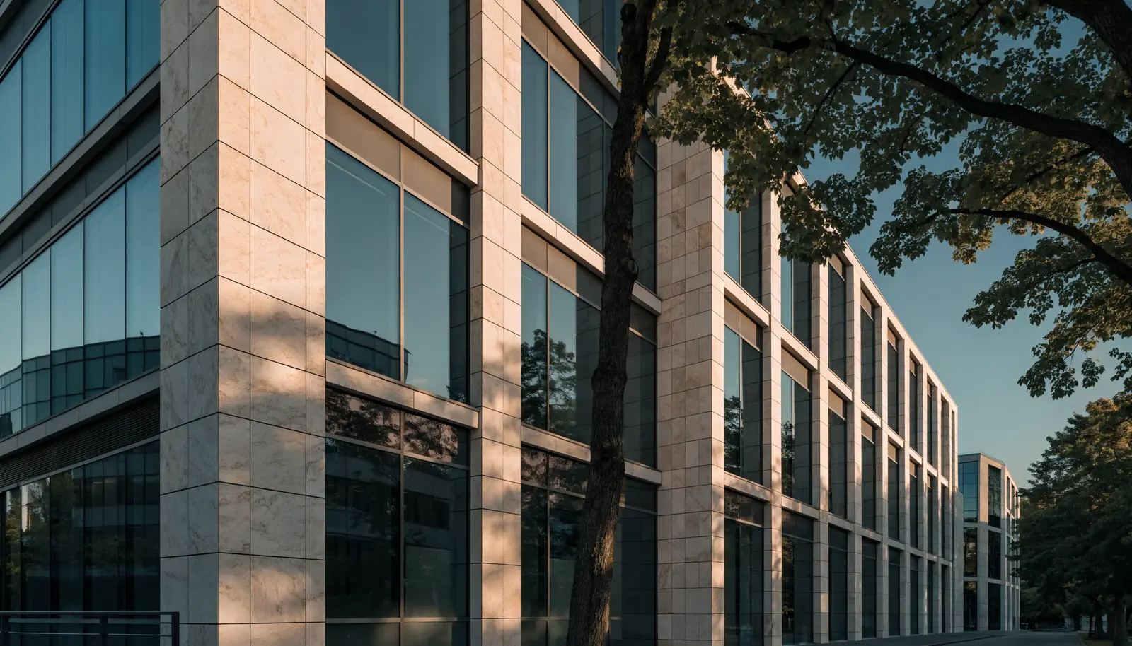
Quiet buildings
A studio of nine, working on very few projects at a time.
See selected workA variable font lets every letter sit at any weight, so a wave of boldness follows the cursor across the headline. One font file, infinite weights, and it loads faster than shipping three separate cuts. This panel always shows a variable face, because not every typeface is one.
Right forBrands that can be a little bit clever about type. Studios, technology, editorial, education.
Highlight sweep
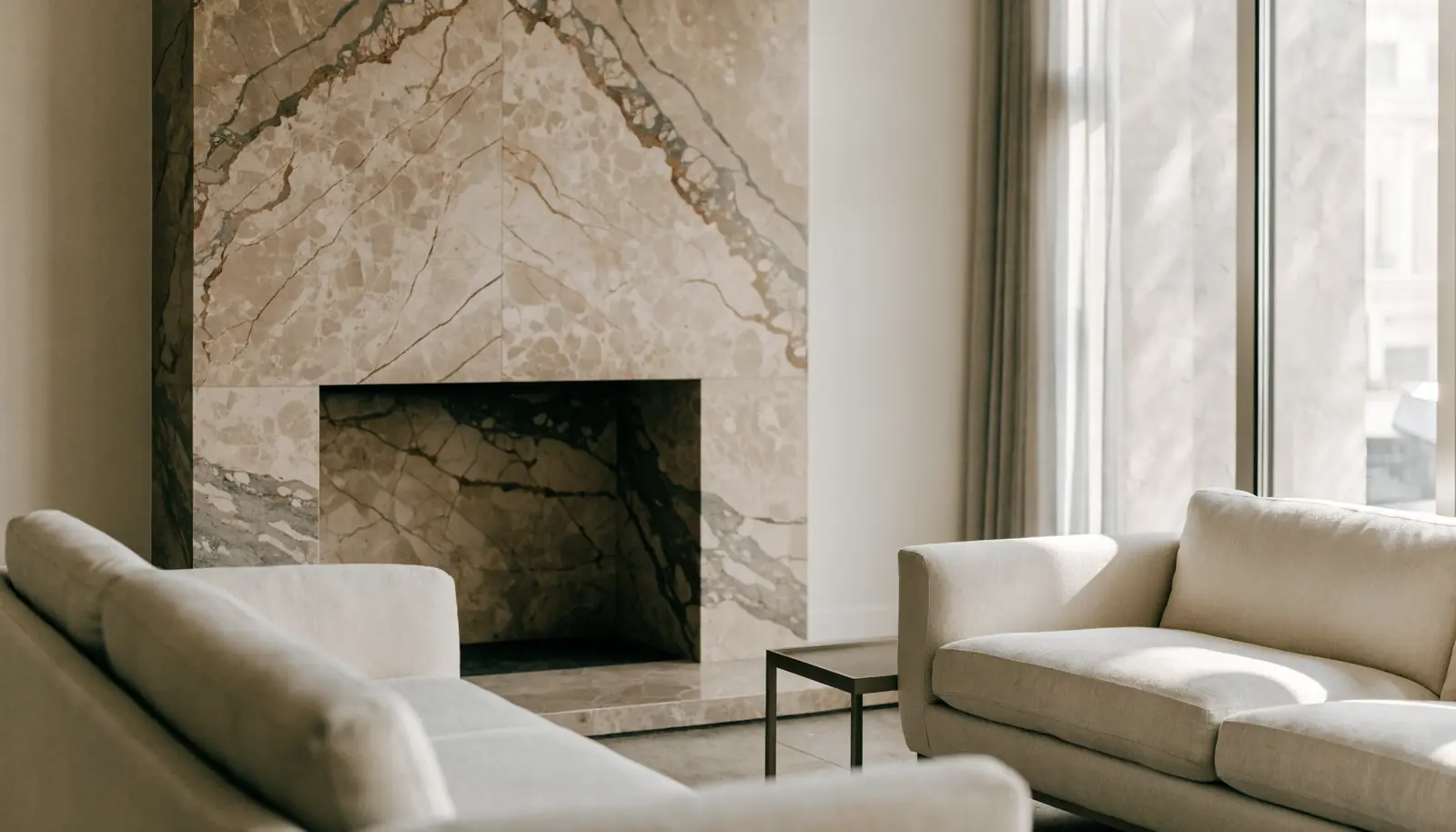
The room is yours for the whole evening, not a two-hour window.
EnquireA highlighter stroke grows behind the phrase you most want remembered. Cheap, obvious, and it works on absolutely every kind of business.
Right forAnywhere you have one sentence that closes the sale.
Drawn wordmark
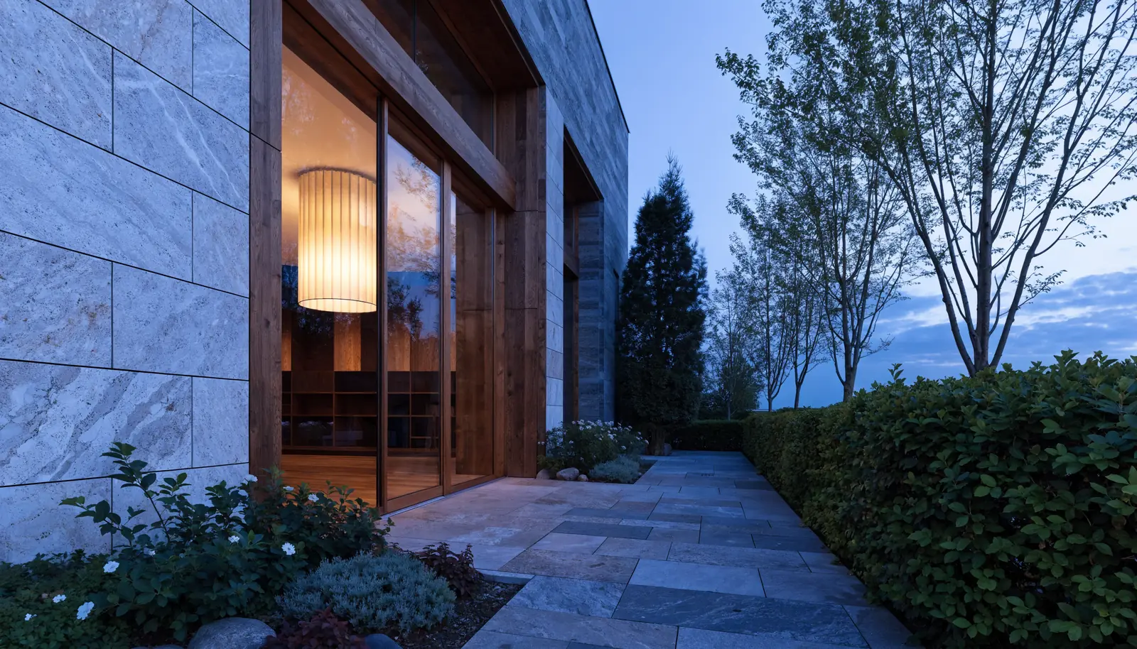
The wordmark draws itself in outline, then fills solid. The best possible use of a logo animation: three seconds, no video file, and it still works printed on a business card.
Right forAny business with a typographic logo. Especially good on a loading screen.
Section marker

Everything we do,
and nothing we don't.
Four practice areas. We will tell you honestly if you need somebody else.
See our servicesA rotated micro-label and a hairline drawing down the margin. Nobody consciously notices it, and it is most of the difference between a template and a designed page.
Right forEvery long page. This is the detail that makes the rest of the work look intentional.