Trailing ring
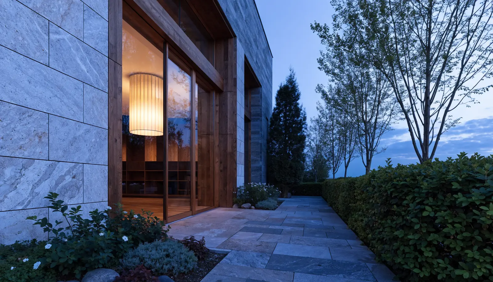
A long table,
and no one else booked.
Book a tableA small dot rides the pointer and a ring chases it a beat behind, swelling over anything clickable. The most requested cursor we build. It signals “this site was designed” inside one second.
Right forAnywhere first impressions carry the sale. Studios, hospitality, fashion, property, agencies.
Magnetic buttons
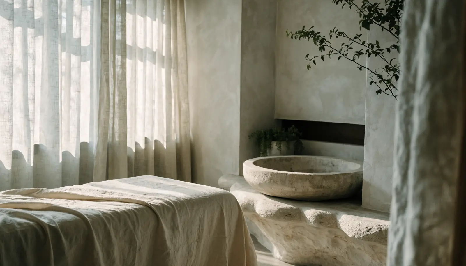
Water, shade,
and silence.
Six treatment rooms, a cold plunge, and a garden nobody photographs.
Book a consultThe button leans toward the cursor as it approaches and springs back when it leaves. Purely tactile, and it measurably lifts clicks on the one button that matters.
Right forEvery site, on the primary call to action. Never on more than two buttons a page.
Spotlight
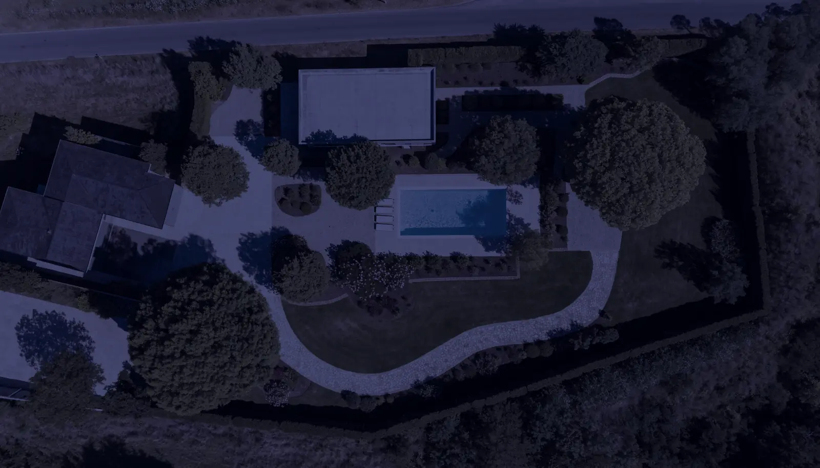
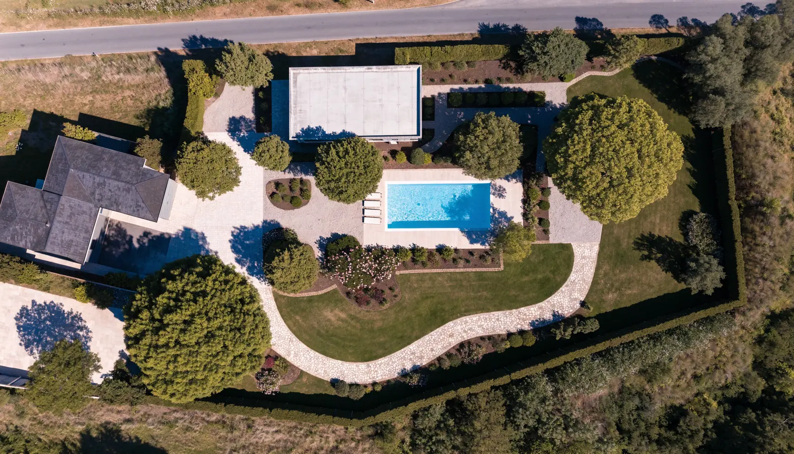
The same room,
eight weeks apart.
See the projectThe cursor carries a hole through the top layer to whatever sits underneath. Before and after, day and night, sketch and finished. Genuinely useful, not just decorative.
Right forAnyone selling a transformation. Renovation, landscaping, dentistry, fitness, cleaning, restoration.
Label cursor
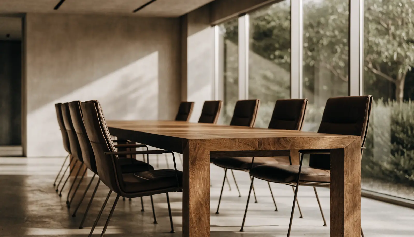
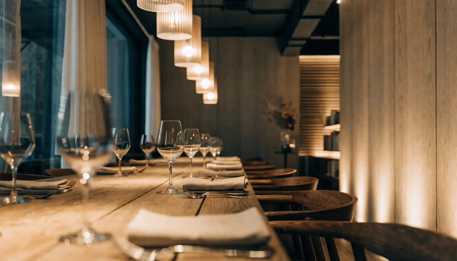
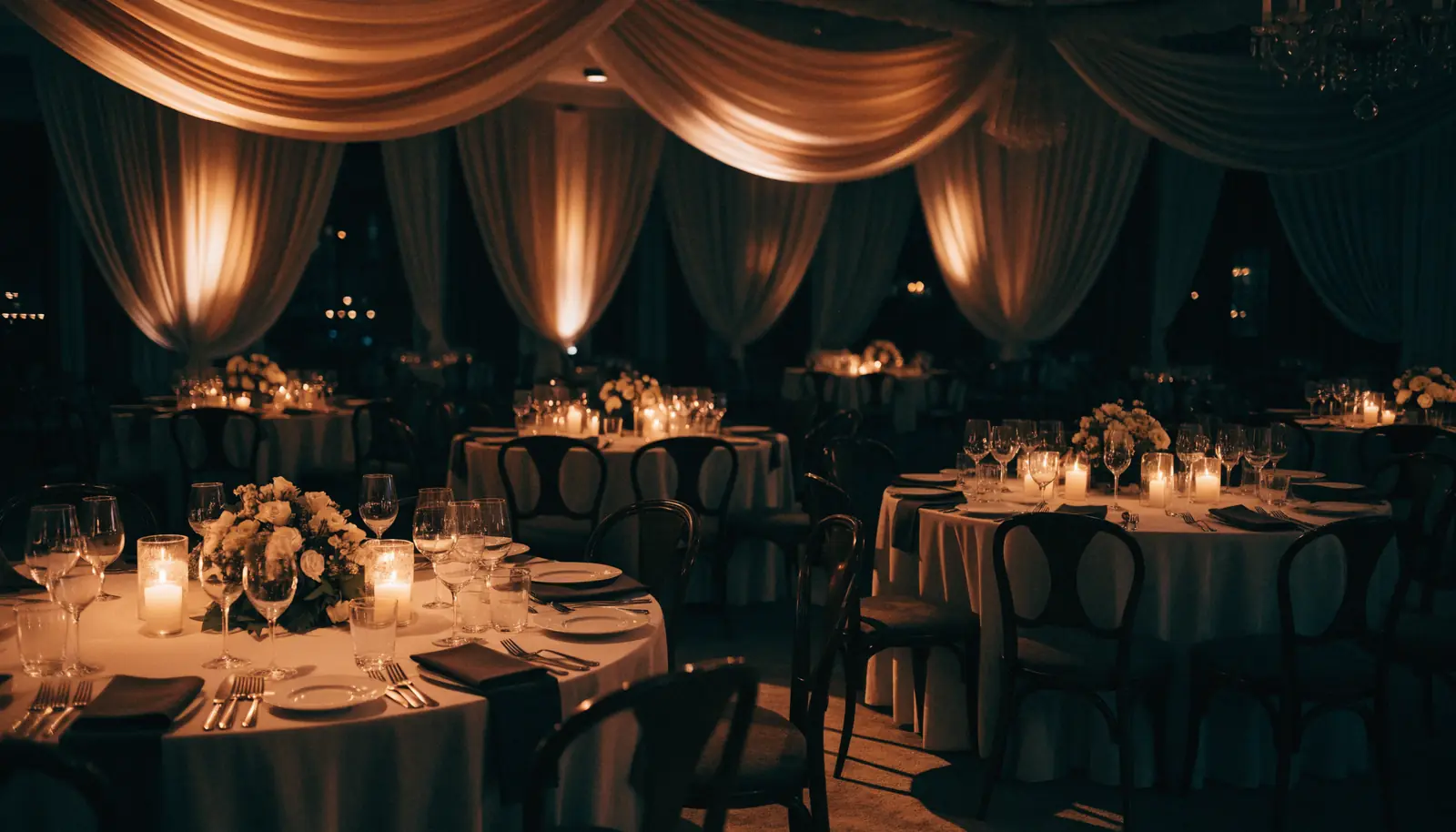
The pointer picks up a label from whatever it is over. View, Play, Drag. It removes the need for buttons sitting on top of your photography, which is how galleries stay clean.
Right forGalleries, portfolios, lookbooks, menus, property tours, before-and-after sets.
Image trail
Vessel
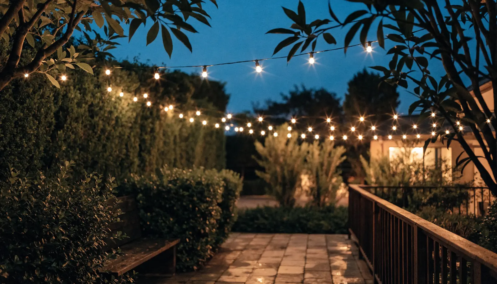
Start a projectPhotographs drop along the path of the cursor and fade out behind it. The loudest effect on this page, so use it on one page only, usually the home page or an About.
Right forBusinesses expected to be interesting. Studios, photographers, agencies, fashion, hospitality.
Card tilt
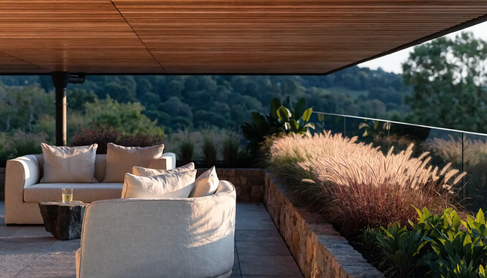
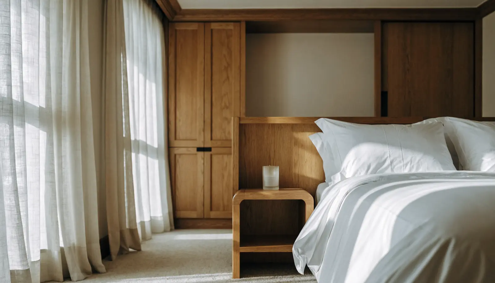
The card turns to face the cursor with a light source that travels across it. The workhorse for product and listing grids, subtle enough to run on twenty cards at once.
Right forAnywhere there are many cards. Products, listings, rooms, menus, team pages, treatment lists.
Hover peek
 Move your cursor insideAuto
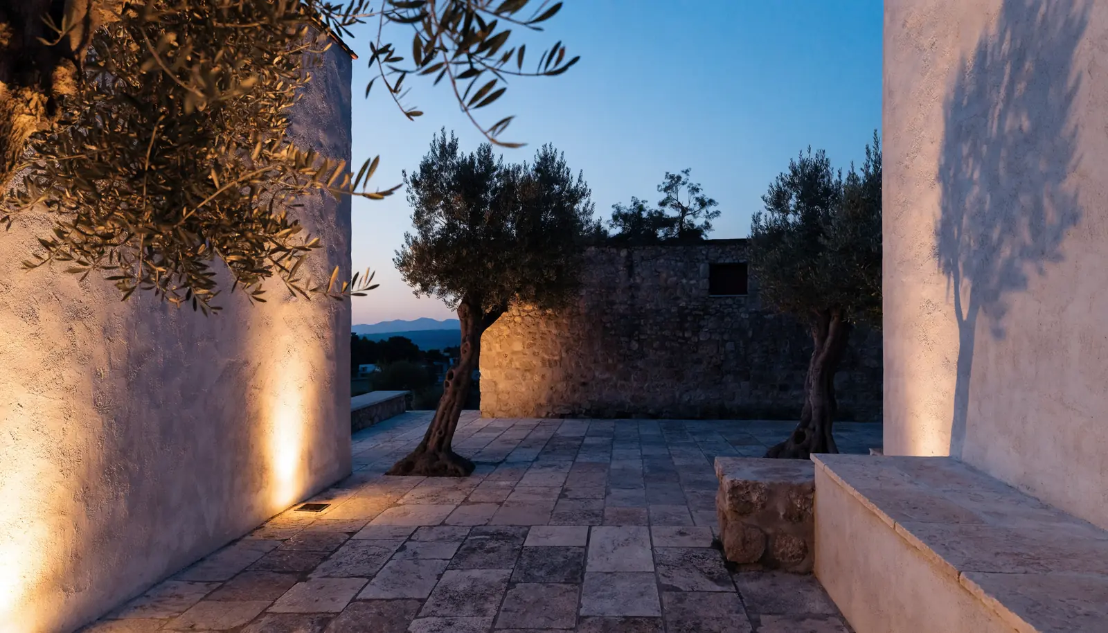
A text menu that shows a photograph on hover, floating beside the cursor. Lets a navigation stay entirely typographic and still be visual. It is the trick behind most agency menus you like.
Right forAny site with four to eight main pages. Replaces a cluttered dropdown outright.
Directional fill
The color floods in from whichever edge your cursor crossed, and drains out the side you leave by. A detail nobody consciously names and everybody feels. It goes on every button we ship.
Right forEvery site, in every industry. This is craft, not decoration, and it costs nothing to include.
Loupe
Every measurement,
drawn to scale.
Download the plansA magnifying glass follows the cursor at nearly three times scale. The one effect here that is useful rather than decorative: plans, drawings, fabric, jewelry, artwork, engineering detail.
Right forAnyone selling something with fine detail. Developers, jewellers, textiles, art dealers, manufacturers.
Difference circle
We take on very few matters.
Nine partners. One office. Work that rarely gets talked about.
Make an enquiryOne blend mode inverts everything the circle passes over, so the cursor stays legible on any background at all. It reads as art-directed rather than decorated.
Right forBrands that can carry something graphic. Agencies, galleries, fashion, portfolios, publishers.