Reveal on entry

one roof.
Each element fades up as it crosses into view, a beat behind the one before it. The single most valuable effect on this page. It makes an ordinary page feel considered and it costs almost nothing.
Right forEveryone. This is the baseline we put on every site we build, in every industry.
Pinned chapters
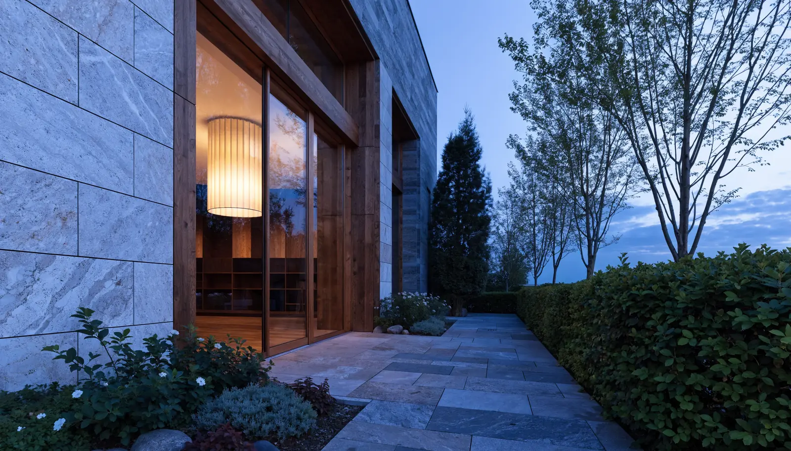
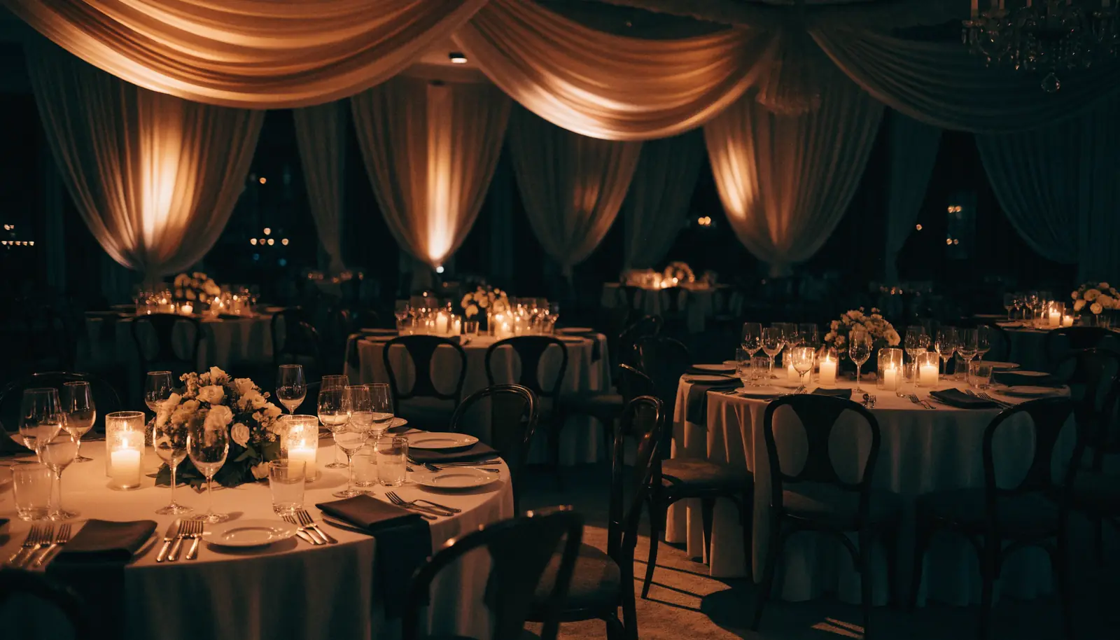

The section locks to the screen and the photography changes underneath it while the visitor keeps scrolling. This is how you tell a three-part story without asking anyone to click.
Right forAnything that happens in stages. A treatment plan, a build process, a menu, a case study, a customer journey.
Parallax layers

Background, midground and headline travel at three different speeds, so the page gains depth without gaining weight. Subtlety is the whole trick: if a visitor notices it, it is too strong.
Right forAnywhere the site itself should feel three-dimensional. Architects, developers, manufacturers, galleries.
Horizontal gallery
one point of view.




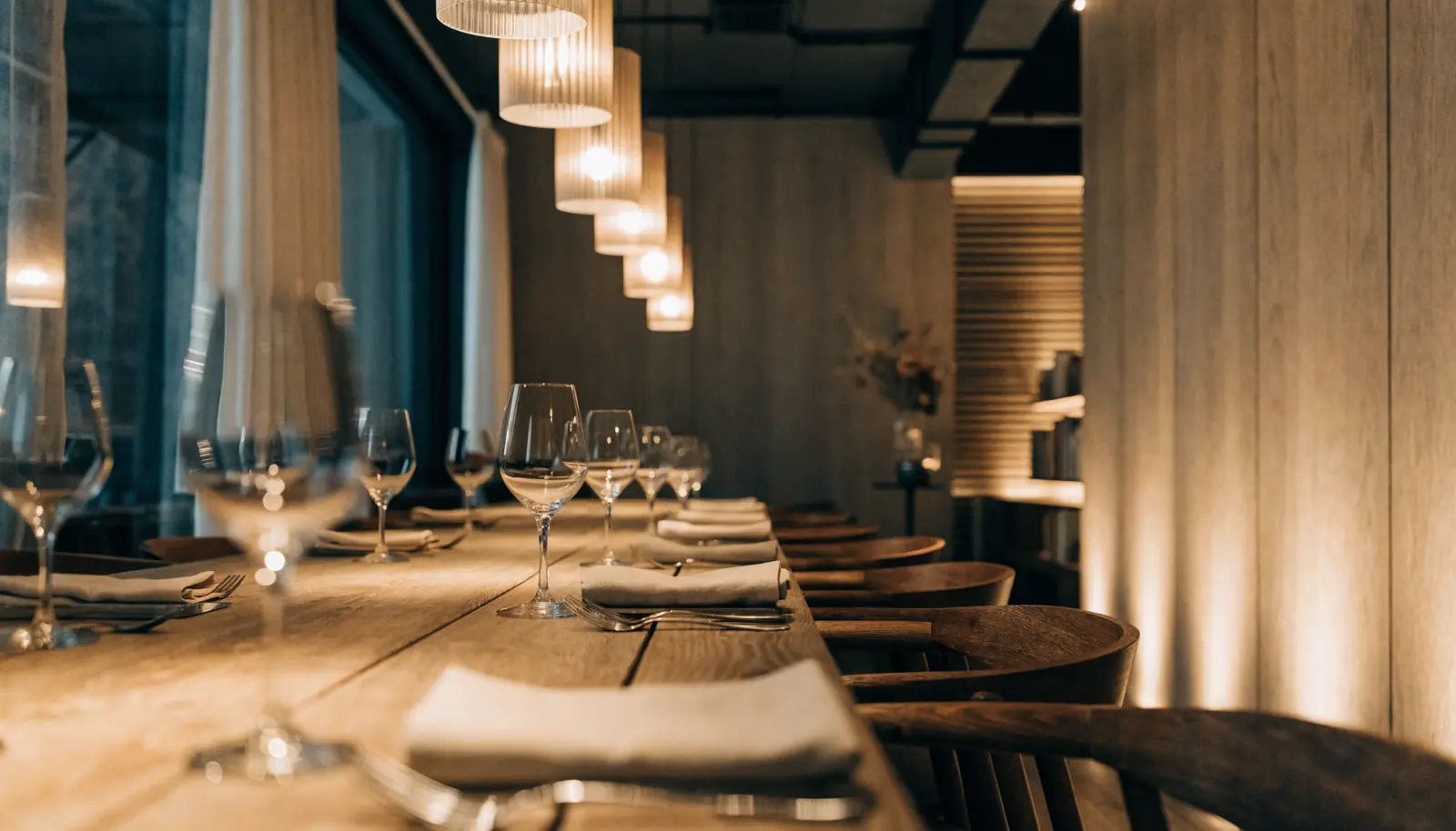
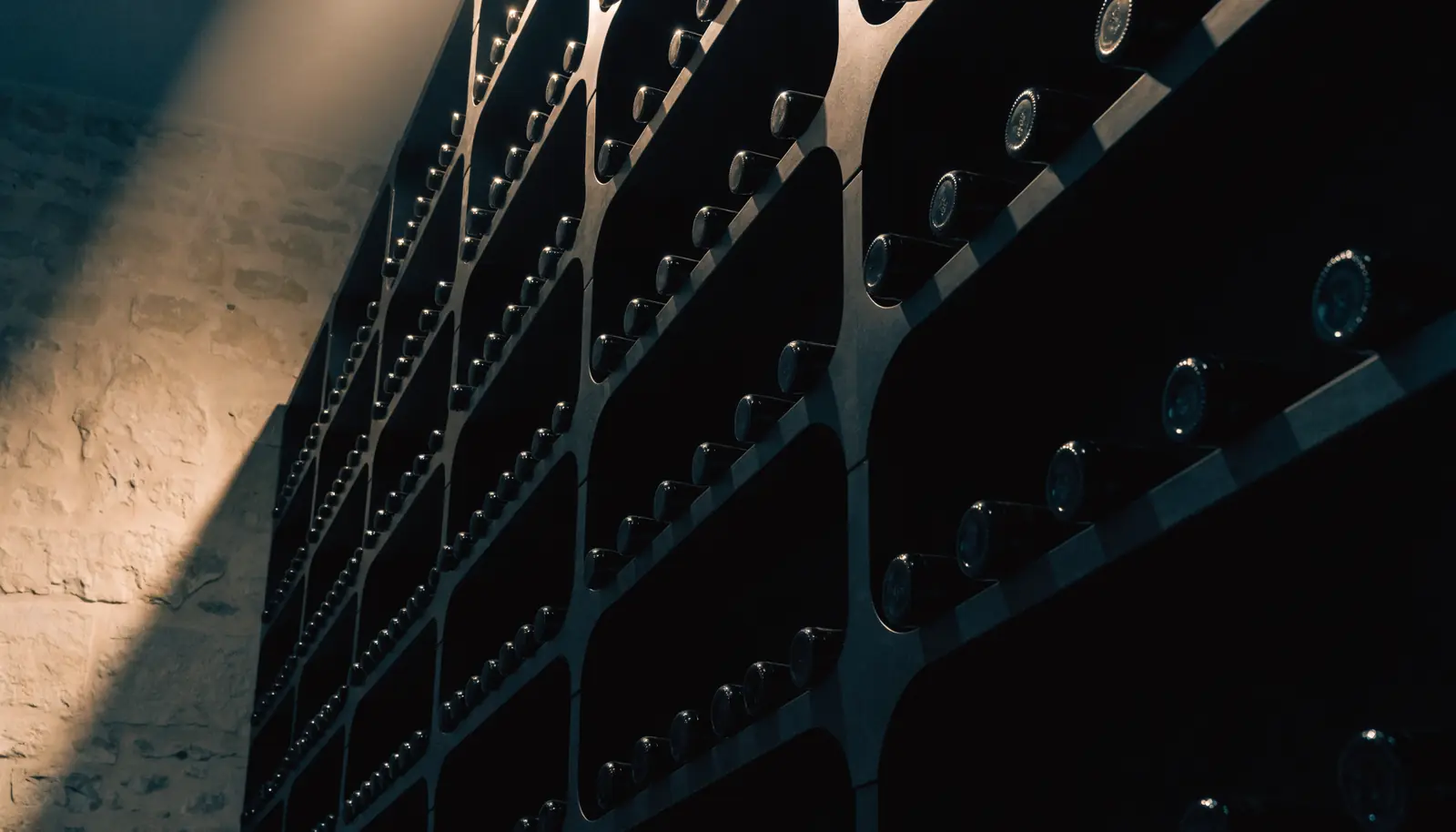


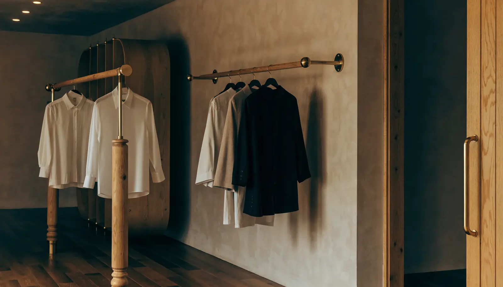
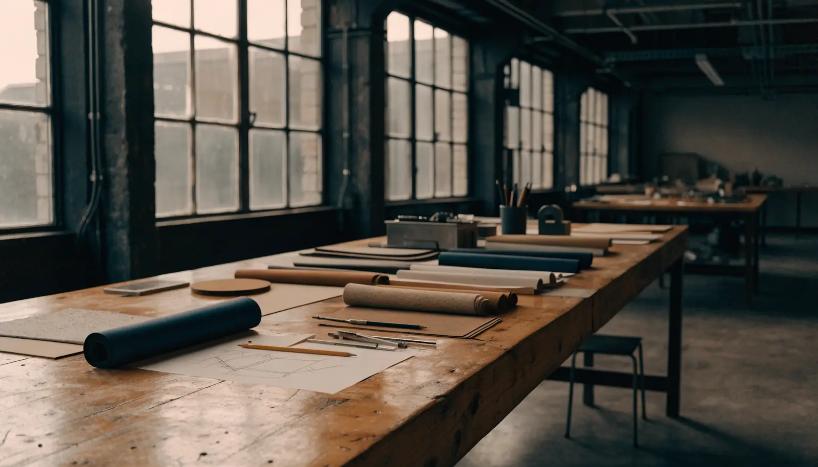
Scrolling down drives the gallery sideways. Shows a great deal of work in very little page, and nobody has to find a tiny arrow button to see it.
Right forAnything with more than six images. Portfolios, product ranges, menus, treatment lists, property galleries.
Mask reveal
Photographs uncover from the bottom edge while easing back from a slight push-in, instead of simply fading. Makes a plain image grid feel like a printed magazine turning pages.
Right forAnywhere the photography is the argument. Interiors, food, property, fashion, dentistry before-and-afters.
Hero into card

The full-bleed hero shrinks into a framed card as the visitor leaves it, handing the page over to the content. A clean way to end a hero without a hard cut.
Right forAny site with a big opening image and a lot of copy underneath it.
Line by line

Each line slides up from behind an invisible edge, like type being set by hand. Reserve it for one headline per site; used everywhere it stops meaning anything.
Right forThe single most important sentence on your home page, whatever business you are in.
Figures count up
Figures roll up from zero as they arrive. The oldest trick here and still the most persuasive: a number that moves gets read, a number that sits there does not.
Right forAnyone with proof worth stating. Years trading, jobs completed, response times, satisfaction, capacity.
Read-along
We started this in a spare room in 1998 with two clients and one van. Everything since has come from people telling other people. That is still the entire plan.
Words brighten one at a time as the visitor scrolls, so the paragraph effectively reads itself. Slows people down on the one paragraph you most want read.
Right forA founder's letter, an origin story, a promise. Once per site, never twice.
Stacking cards
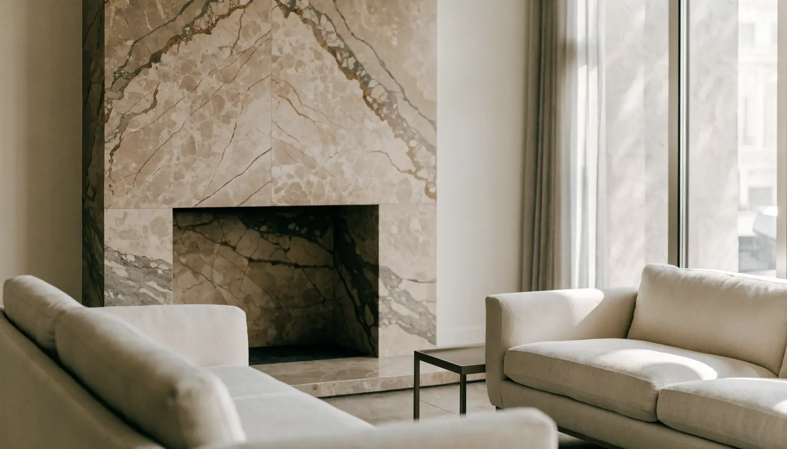
Each card sticks beneath the one before it and the deck builds as you scroll. Perfect for a numbered process, because the stack itself shows how many steps are left.
Right forAnything sold as a process rather than a product. Services, onboarding, treatment plans, builds.
Before and after
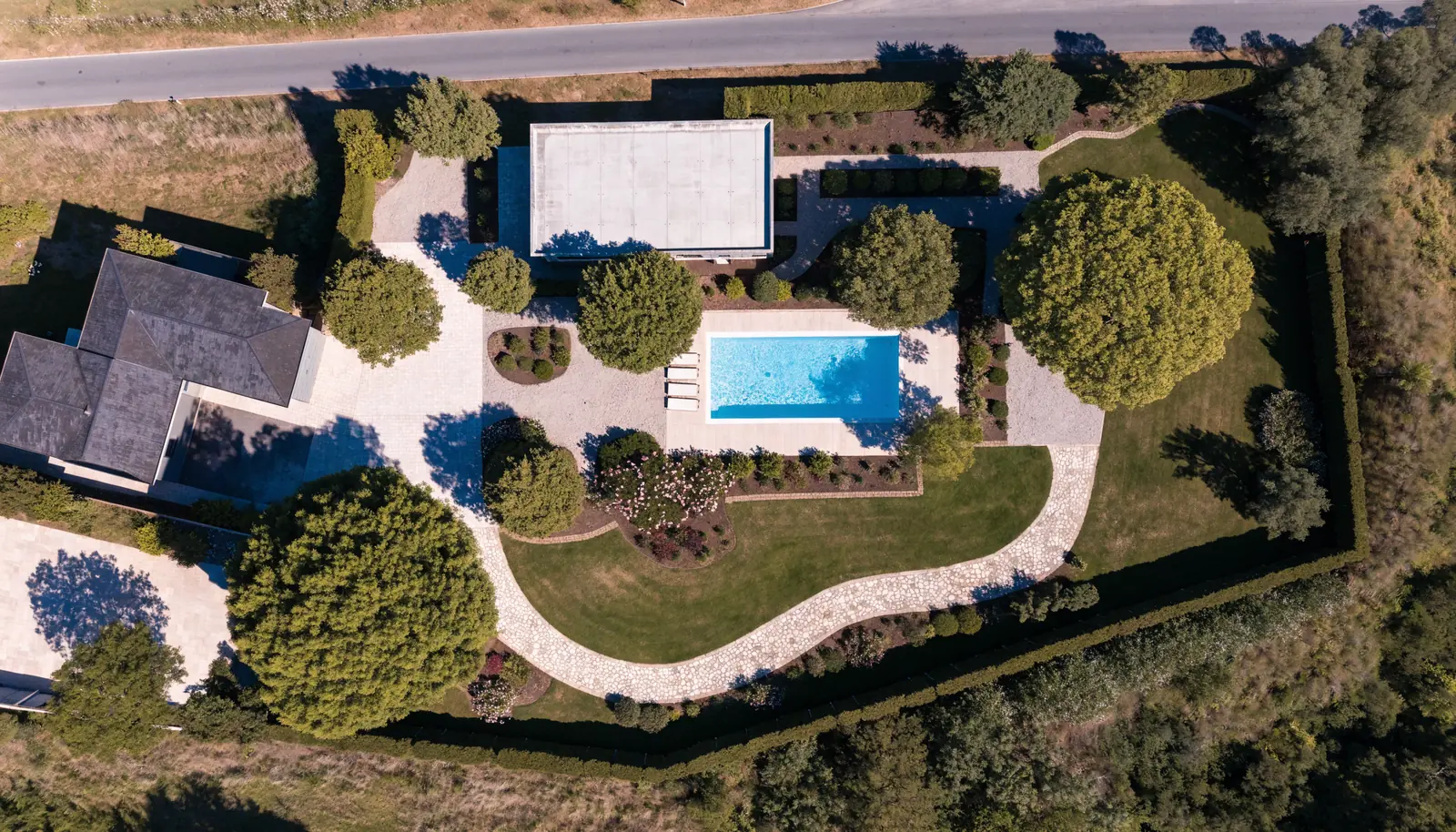
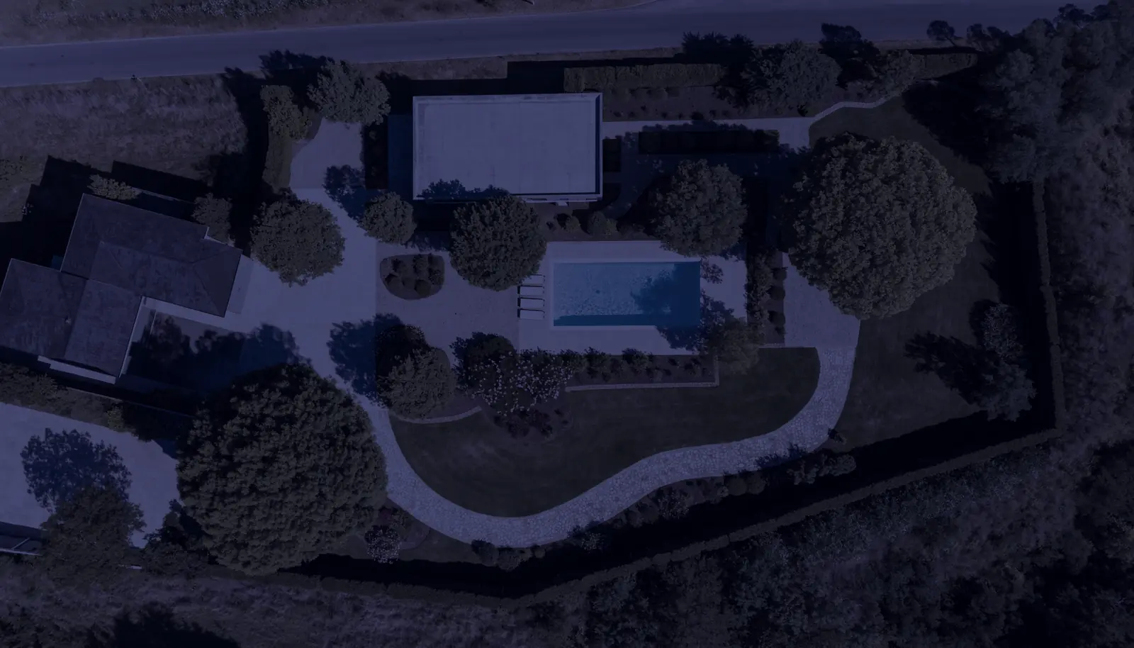
Two photographs of the same frame, cross-faded by scroll position, with a label that keeps pace. Two images doing the work of a video at a fraction of the weight.
Right forAnyone selling a change. Renovation, landscaping, dentistry, fitness, cleaning, restoration, day-to-night venues.
Progress and index
A hairline progress bar plus a side index that lights the section you are in. On a long page this is the difference between “where am I” and “I will keep going”.
Right forLong-form pages: services, annual reports, case studies, price lists, terms anyone actually has to read.